Buttons provide our site visitors with clear visual references to interact with rackspace.com. They are colorful and offer contrast to the content they appear. This contrast, coupled with clear and concise verbiage, instructs the user to engage with the website.
Primary Buttons
Site visitors need to take action to complete tasks presented on the website. Different tasks have different levels of importance depending on the content and goal of the page. Our site visitors must be able to visually distinguish the difference in importance of these actions in relation to other actions on the page.
When to Use
Primary buttons are one of two types of call to action buttons used on Rackspace.com properties. Primary buttons are used for important actions that relate to the rest of page. Use primary buttons to guide the customer to the primary call to action of a page. Over use of primary buttons on page dull the impact they have on the site visitor.
How to use
Primary buttons visually contrast from other colors and content on the page. Make sure the text within the buttons are straight forward and inform the site visitor exactly what will happen next once they interact with it. Use direct language and few words. Primary buttons that read “Contact Us” or “Sign Up” are good examples of this language.
User Story
While investigating web hosting companies Tom hears good things about Rackspace. He finds his way to the Cloud Servers page on rackspace.com and discovers we have the perfect cloud product to fit his need. Having made the decision to purchase cloud hosting from Rackspace he clicks the “Sign Up Now” button prominently displayed on the product page and begins completing the sign up form.
Design Rationale
Site visitors rarely read web pages word for word. Instead, they scan the page looking for words and sentences. Buttons allow them to visually pick out the expected action for them to take on a given page.
Example
Primary Button displayed on a Cloud Product page

Secondary Buttons
The site visitor is not ready to perform the primary action on the page and is looking for additional information in their journey.
When to Use
Secondary buttons are the second type of call to action buttons used on Rackspace.com properties. Secondary Buttons are used for less important actions than primary buttons and help guide site visitors to additional information.
How to use
Make sure the text within the secondary button prompts the user with optional content. Similar to the primary buttons, the text should be direct and use few words. Since our secondary buttons focus on giving our site visitors additional information, it is helpful to use text that evokes a feeling of inquisitiveness.
User Story
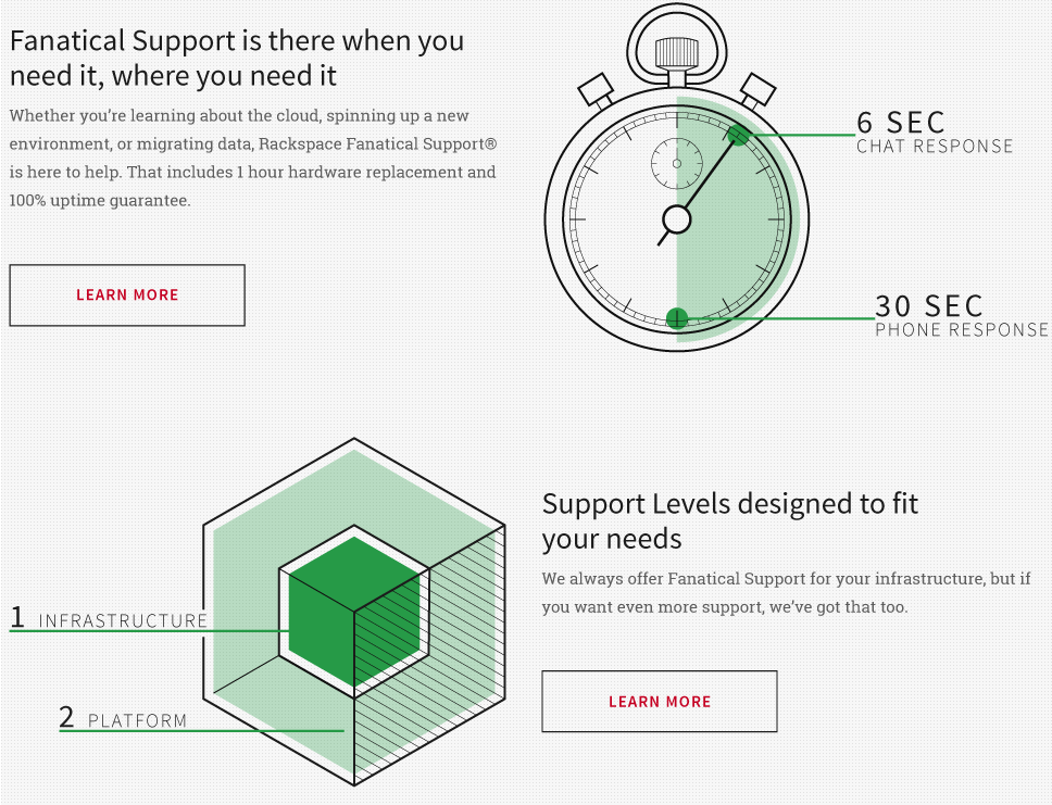
Michelle was new to Rackspace.com and saw some content on the homepage talking about Fanatical Support. Curious, she wanted to learn more about Fanatical Support and how it was different from other hosting providers she was researching. When she clicked the “Learn More” button on the homepage, she was provided detailed information explaining what Fanatical Support is and how it can help her and her business.
Design Rationale
Secondary buttons give a page greater interactivity allowing for additional conversations to unfold based on the interests of the site visitor. Since these are given lower importance when compared to primary buttons we visually down play its appearance.
Example

Chat Button
Site visitors may need to reach out for quick answers to questions but may enjoy the anonymity of being able to ask the questions without being identified. Other times they may need information but are busy performing other tasks and cannot break away for a phone call.
When to Use
Chat buttons allow site visitors to interact directly with our brand. For prospective customers this can represent the try-before-you buy experience where they measure if we can truly deliver Fanatical Support. When a site visitor interacts with a chat button they will be in touch with a live Racker in moments which is a big competitive advantage in our business.
How to use
Prominently and consistently display chat buttons on the website to enable site visitors to quickly access the chat and get the answers they need at any time in their experience on the website. Letting the site visitor know Rackspace is just a click away helps us deliver Fanatical Support.
Design Rationale
Chat buttons provide quick access for our site visitors to ask questions specific to their needs. It creates a system of anonymity that reduces the sometimes intimidating situation of asking questions and allows us another way to always be there for them 24x7x365. The chat bubble is a globally recognized icon that most site visitors are familiar with. In some instances, we include the text “Live Chat” to reinforce our availability.
Example

Play Button
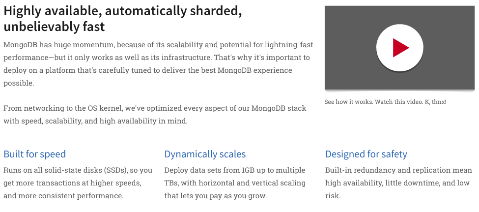
Play buttons provide access to video content. Videos help show site visitors complex information through voice and visuals.
When to Use
Use a video button when the information contained in the video educates and furthers the conversation. Video content assists site visitors in making informed decision about the product or service they are considering.
How to use
Play buttons should contain a background image containing a screen capture of the video that will be played when clicked or tapped. Place the video in near proximity to related content that supports the content found within the video. Providing the site visitor with content describing the benefits of a product paired with a product demo is a perfect way to leverage video buttons.
User Story
Ryan is a visual learner and is interested in purchasing web hosting. The problem; Every web hosting site seems to promise great service and ease of use but he is having a hard time understanding the complexity of each. While exploring the Cloud Servers product page he discovers a helpful play button that activates a video with a nice demo of the product. After watching the video he better understands the Cloud Servers product’s ease of use and likes the idea of being able to pick from multiple support levels to match his needs. He interacts with the primary “Sign Up Now” button and signs up for an account with Rackspace.
Design Rationale
There are seven established learning styles and each of our site visitors has their own combination of learning styles that are unique to them. Offering video content creates a more interactive experience on the website and offers visual, aural, verbal, and physical learners to engage and learn in a way that best appeals to them. But not all site visitors are interested in watching a video or may not have the opportunity to watch right at that second (they could be in a meeting, in the office without headphones, etc.). We design with a content first approach and use videos to enhance and supplement copy on a page.
Example

Social Media Links
A site visitor obtains engaging content through a rackspace.com web property and is motivated to share the content via social media.
When to Use
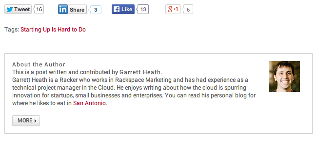
Use when creating content appropriate for sharing on social media sites. For example, a blog post with a great video or informative infographic. Overuse of this pattern can detract from the content on the page or site. Make sure social buttons are proportional to the layout of the page they reside.
How to use
Implement social media buttons that use the iconographic standards for their respective social media outlet. Place the icons in a location that corresponds to the importance placed on sharing the content. Attaching social media buttons on top of or adjacent to the content implies a high importance for sharing. Placing social media buttons at the end of content impllies a low importance for the sharing activity.
Design Rationale
Using this design pattern influences the site visitor to further engage with the Rackspace brand. When individuals share content they become promoters. Individuals seeing this shared content put additional eyes on Rackspace and can drive adoption.
Example
