Eyebrow
The most common interactions for a website are provided to the site visitor at the top of each page.
When to Use
Include an eyebrow on every page of every Rackspace website/property, including landing pages. Pieces within the eyebrow may need slight modification to best suite your site.
How to use
The eyebrow is placed at the top of each page found on the website. It contains branding information in the far left corner and common actions for the site visitor to complete. These can include log in access, signup options and ways for site visitors to get in touch.
Design Rationale
The eyebrow element promotes consistency across a website. Mental capactiy is used as the brain processes information. Ensuring all pages within a given website have the same eye brow element frees up mental capacity for the site visitor. The site visitor is tasked with only processing new information on a page as they traverse the site. Important tasks are brought to the forefront of a site visitors experience when placed in the eyebrow element.
Example
Eyebrow for rackspace.com properties

Global Navigation
The site visitor needs to quickly and easily path to a given section of a web site. We use the global navigation in conjunction with the hero banner as a general way finding device to assist in our site visitors pathing throughout the site.
When to Use
Apply the global navigation element to all pages within a given website. If you’re working on a marketing landing page (e.g., for a pay-per-click (PPC) campaign, display ad campaign, etc.) that is not incorporated into the global website, please do not use this element.
How to use
Global navigation is the second element on the website and is placed directly below the eyebrow. On desktop, a way finding carrot appears to help the site visitor understand where they are within the site.
Design Rationale
Consistent global navigation allows customers to safely explore our product offerings. By presenting a consistent navigation element at the top of the screen a customer is able to delve deeper into the task they want to accomplish. As they move through various product screens they are provided a visual anchor. This is especially important when dealing with the technical information displayed on our screen as it gives them a way to navigate back to a friendly page if they find themselves in uncharted territories
Hamburger
When viewing a website on small screens (tablet and mobile) it becomes difficult to display all navigation items in the limited space.
When to Use
When preparing a site for tablet and mobile or small screen viewing experience.
How to use
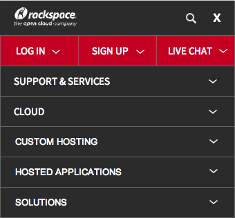
Move navigation items behind the hamburger element. On tap, the hamburger opens and displays the navigation items. The hamburger icon is replaced with a close out button. When the hamburger is closed, the items will hide and returns to its original state.
Design Rationale
Toggling these items below a hamburger element maximizes screen real estate at small view ports without limiting the navigation. Including a hamburger element allows for a cleaner mobile experience with easier navigation.
Example
Hamburger element closed

Hamburger element expanded

Item Pagination
The site visitor is accessing a large set of data that cannot be displayed on a single page.
When to Use
Use when a large data set is being returned to a site visitor. Examples may include search results, blog, and knowledge center articles.
How to use
Implement pagination on the bottom of the data set. Include an interaction scheme to path between first and last pages as well as pages in between.
User Story
Ryan has purchased the Cloud Servers product and is attempting to load his ecommerce solution on to his Cloud Server. He is eager to switch his site but wants to ensure that he has configured his Cloud Server in as secure a manner as possible. He browses the Rackspace Knowledge Center and searches for security information. He receives a multitude of search results that relate to his topic. He understands the pagination displayed below his search results provide him access to browse through the information housed in the Rackspace Knowledge Center.
Design Rationale
Pagination segments the amount of data provided to a site visitor. By providing the data in consumable chunks it allows the site visitor to gain a better understanding of the scope of the data. The site visitor understands the size of the data set and offers a decision as to whether or not to continue viewing the data.
Example

Main Footer
Site visitors may need access to a specific feature or link on the site and signals the end of the page.
When to Use
Use when you need to add uniformity to a webpage from both a layout and feature perspective. Links in the footer provide a secondary level of navigation for site visitors to explore. If a footer is implemented on the top level, or homepage of the website it should appear on subsequent pages similar to the Eyebrow element.
How to use
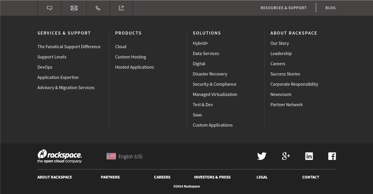
Include the footer at the bottom of each page created. Include relevent links to additional information or interactions from which a site viewer can benefit.
User Story
While exploring rackspace.com Ryan reads the Cloud Servers product page. He makes his way down the page until she reaches the footer. He intuitively knows he has reached the end of the Cloud Servers product page and recalls seeing the same footer on other pages he previously visited. When scanning the footer, he sees a link for Cloud Products and is interested in seeing what other products are available. The footer provides him an easy avenue to explore the Cloud products without the need to scroll back to the top of her current page. He selects the “Cloud” text link in the footer and continues browsing the site.
Design Rationale
By including a footer element you give visual consistency and familiarity to the website while eliminating a potential “dead end” scenario where the site visitor has exhausted their natural progression through the site. The secondary navigational content embedded within the footer provides additional routes for the site visitor to take to continue exploring the site.
Example
Footer from rackspace.com

Navigation Drop Down
Navigation drop downs provide site visitors with links to pages of content and allows them to browse the type of content available within sections of the site.
When to Use
Use when displaying large navigation schemes that cannot be easily displayed on the screen. Use to isolate and bucket navigation into a scheme that fits the site visitors goals.
How to use
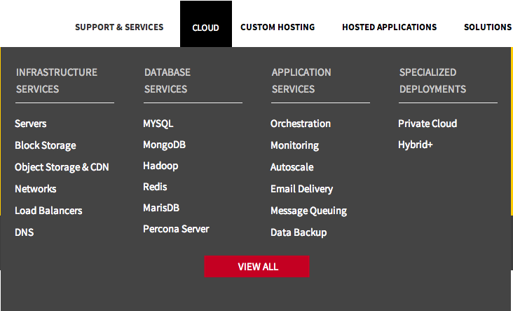
Include the top level category as the interaction point to launch a drop down. When a site visitor clicks or taps the interaction point, the list of page links are displayed. Naming of links should be direct, concise, and set proper expectations to the user for what information will be available on that page. Using the language of the site visitor is preferred.
User Story
Tom is starting a side project at his company that requires web hosting. He has learned about Rackspace from a work associate who recommends their cloud services. He starts browsing rackspace.com looking for a solution. He interacts with the ‘Solutions’ drop down menu from the top navigation. The drop down displays categories of solutions and he selects the one that fits his project.
Design Rationale
Displaying too many interactions and/or paths to a site visitor can lead to option paralysis. Navigation drop downs remove this added cognitive lifting and breaks things down into consumable chunks.
Example
