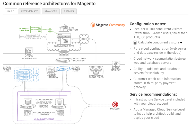
Vertical and Horizontal Tabs (Reference Architecture)
A site visitor is interacting with a solution that comes in varied sizes or configurations.
When to Use
Use when site visitors want to uncover complexity through interface interaction.
How to use
Include either the horizontal or vertical tabs in the content section. Vertical tabs should be used when more sections exist than can be fit comfortably across a screen. Include text on the tab to orient the site visitor to the content uncovered upon interacting with the tab.
User Story
During her site visit Mary finds the reference architecture section for Magento, her desired ecommerce solution. The complexity of the solution required is unknown to her. She browses the basic, intermediate, and advanced tabs to understand the options available to her. Using the ‘basic’ architecture as a launching point to start a conversation, she phones Rackspace to speak with a sales person.
Design Rationale
Including this design pattern allows a site visitor to pick a solution that fits their needs. Assigning small, medium, large categorization enables customers to compare solutions in a relationship.
Example
