Fundamental markup for a Rackspace branded experience.
Layout Framework
The basic layout of Canon consists of 5 parts: 3 layers of navigation within the header, the content area, and the footer.
- The utility navigation consists of links and tools that help the user, such as account details, log out, or help information, but are not the core sections of the application.
- The primary navigation is used for the main sections of the application or for dropdown categories that organize sections into higher level groups.
- The secondary navigation is used for a 2nd or 3rd level of navigation, depending on the structure of the primary nav.
- The content area is used for your application's main data and interactions.
- The footer is used for legal information, application news, and feedback links.
How it works
Canon predefines options for page layout via the content area styles but sometimes a grid system is needed for content within those sections or for custom layouts. As such, Canon includes a responsive 12 column fluid grid.
- Create a grid row with the
rs-rowclass - Add the appropriate number of
span-*columns. As this is a 12-column grid, eachspan-*spans a number of those 12 columns, and should always add up to 12 for each row - The column gutters can be removed by using
rs-row-collapseas the row class - Offsets can be applied with
offset-* - Nest grids by adding a new row and columns within a
span-*column
Responsive Options
- The default
span-*columns stack vertically for viewports under 768px - To prevent vertical stacking use
small-span-*column classes
Examples
Default grid created with a rs-row and span-* columns
Column offsets via offset-*
Nested Grid
Grid without column gutters via rs-row-collapse
Markup
<!-- Default Grid -->
<div class="rs-row">
  <div class="span-2">span-2</div>
  <div class="span-10">span-10</div>
</div>
<div class="rs-row">
  <div class="span-6">span-6</div>
  <div class="span-6">span-6</div>
</div>
<div class="rs-row">
  <div class="span-4">span-4</div>
  <div class="span-8">span-8</div>
</div>
<!-- Grid Offset -->
<div class="rs-row">
  <div class="span-6">span-6</div>
  <div class="span-4 offset-2">span-4 offset-2</div>
</div>
<div class="rs-row">
  <div class="span-8 offset-1">span-8 offset-1</div>
  <div class="span-3">span-3</div>
</div>
<!-- Nesting Grid -->
<div class="rs-row">
  <div class="span-4">span-4
    <div class="rs-row">
      <div class="span-6">span-6</div>
      <div class="span-6">span-6</div>
    </div>
  </div>
  <div class="span-8">span-8
    <div class="rs-row">
      <div class="span-4">span-4</div>
      <div class="span-8">span-8</div>
    </div>
  </div>
</div>
<!-- Collapse Column Gutters -->
<div class="rs-row-collapse">
  <div class="span-2">span-2</div>
  <div class="span-10">span-10</div>
</div>
<div class="rs-row-collapse">
  <div class="span-6">span-6</div>
  <div class="span-6">span-6</div>
</div>
<div class="rs-row-collapse">
  <div class="span-4">span-4</div>
  <div class="span-8">span-8</div>
</div>
Types of Navigation
Utility Navigation:- Top-right: Used for utilities like Account information, Support links, Logout, etc
- Top-left: Used to SSO between Rackspace properties.
- Remains consistent across the UIs that it links together
- Highlight the current application with an active state so users know where they are.
- Customize these sections for your application's categories or products.
- Highlight the category with an active state so users know what section they are in.
- Use dropdowns when you have 3 or more levels of information/navigation.
- Highlight the section with an active state so users know what sub-section they are in.
Adherence Rating: 3
Example
Markup
<div class="rs-wrapper">
    <!-- Utility Nav -->
    <div class="rs-nav-utility">
      <div class="rs-container">
        <ul class="rs-nav">
          <li class="rs-nav-item active"><a class="rs-nav-link" href="">Public Cloud</a></li>
          <li class="rs-nav-item"><a class="rs-nav-link" href="">Private Cloud</a></li>
          <li class="rs-nav-item"><a class="rs-nav-link" href="">Dedicated</a></li>
        </ul>
        <ul class="rs-nav rs-pull-right">
          <li class="rs-nav-item rs-dropdown rs-utility-dropdown">
            <a class="rs-nav-link rs-dropdown-toggle" href="">Username123 <i class="rs-caret"></i></a>
          </li>
        </ul>
      </div>
    </div>
    <!-- End Utility Nav -->

    <!-- Primary Nav -->
    <div class="rs-nav-primary">
      <div class="rs-container">
        <div class="rs-nav-brand">
          <a href=""></a>
        </div>
        <ul class="rs-nav">
          <li class="rs-nav-item active"><a class="rs-nav-link" href="">Section1</a></li>
          <li class="rs-nav-item"><a class="rs-nav-link" href="">Section2</a></li>
          <li class="rs-nav-item"><a class="rs-nav-link" href="">Section3</a></li>
          <li class="rs-nav-item rs-dropdown rs-primary-dropdown">
            <a class="rs-nav-link rs-dropdown-toggle" href="">More <i class="rs-caret"></i></a>
          </li>
        </ul>
      </div>
    </div>
    <!-- End Primary Nav -->

    <!-- Secondary Nav -->
    <div class="rs-nav-secondary">
      <div class="rs-container">
        <ul class="rs-nav">
          <li class="rs-nav-item"><a class="rs-nav-link" href="">SubSection1</a></li>
          <li class="rs-nav-item hover"><a class="rs-nav-link" href="">SubSection2</a></li>
          <li class="rs-nav-item active"><a class="rs-nav-link" href="">SubSection3</a></li>
        </ul>
      </div>
    </div>
    <!-- End Secondary Nav -->
</div>
Layout Options
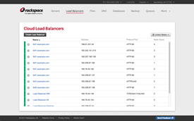
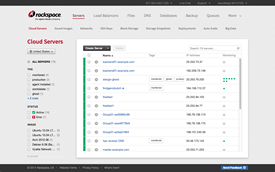
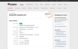
The content area contains the primary information and functionality views for your application. Consistent layout is imperative so users always have a feel for where they are. For example, a List Table should use a different layout than a Detail View.
Sidebars
The position of the sidebars significantly changes based on the content.
- Left Sidebar (Filtering):
Use for functionality that correlates with the main content (filtering). Do not use for navigation or informational text. - Right Sidebar (Help Panel):
Use for information that correlates with the main content (help information, support links, etc). Do not use for navigation or filtering.
Adherence Rating: 2
Examples
| Layout | Thumbnail | Markup |
|---|---|---|
| Full-Width |  |
|
| Left Sidebar |  |
|
| Right Help Panel |  |
|
How it works
The footer looks and behaves similar to the top navigation bar. Just like the top nav, the footer should be consistent across Rackspace applications. If you support multiple geographies, these may change between countries. Below is a list of what it should contain in the order they appear:
- Copyright Date
- Terms of Service
- Privacy Policy
- Application News:
For example: Release notes, new features, or other information that keeps users up to date with your app. - Feedback:
Provide a way for users to submit feedback. This helps your team prioritize features and make users feel involved.
Adherence Rating: 3
Example
Markup
<div class="rs-nav-footer">
  <div class="rs-container">
    <ul class="rs-nav">
      <li class="rs-nav-item">© 2013 Rackspace, US</li>
      <li class="rs-nav-item"><a class="rs-nav-link" href="">Terms & Privacy</a></li>
      <li class="rs-nav-item"><a class="rs-nav-link" href="">Application News</a></li>
    </ul>
    <ul class="rs-nav rs-pull-right">
      <li class="rs-nav-item"><a class="rs-nav-link" href="#">Feedback</a></li>
    </ul>
  </div>
</div>